

Was able to check out a cool event last night at the Art Directors Club. Sol Sender the designer for the Obama logo. The Obama logo was created in 2007 by them, in partnership with MODE.
Steve Juras the creative director over Sol and , a classmate of Sol from graduate school had a long-standing relationship with AKP&D Message and Media, a campaign consulting firm led by David Axelrod and David Plouffe.
They first went through a bunch of old stickers in the past presidential campaigns shown below:


Sol said that they had presented seven or eight options in the first round.
The entire undertaking took less than two weeks for them to go through.
Then they went into logo designs that they did not go for:
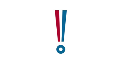

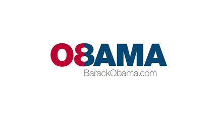
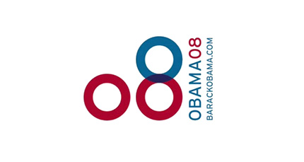

These were the final logos that they decided to go and choose:
Logo Design #1

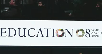
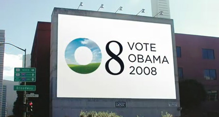

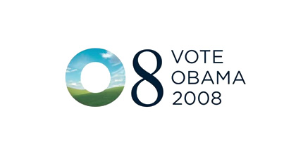
“This masking of different photos with the O shape became an opportunity to say different things in different moments… The O could contain all these different ideas, possibilities and feelings." -Sol
Doesn't the background in the "O" look quite familiar...
Logo Design #2
“There was a lot of excitement about this. People felt this was really something new, something different. It was a kind of populist expression — everyone’s excited about Obama, people are talking… (but) it was a little too far out of the box. We felt that having a little more tradition in the mark was the smart way to go.” - Sol
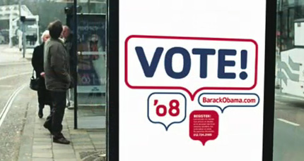

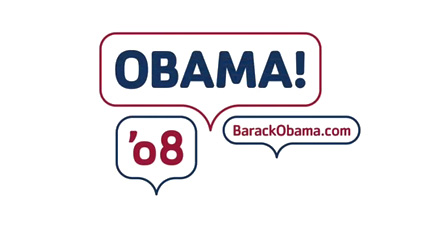
Logo Design #3
Originally the stripes were kind of symmetrically expressed across the horizon, and as we went into final refinements we felt that giving it a little bit more dimension, a little bit more motion, ways to enter into it a little bit more for the viewer was a better way to go.”
Seen below

As you can see Sol made some minor tweaks of the log.

"Simple" Scott Thomas was the creator for the website. You can see what it looked like
BEFORE

And Afterwards Scott did a lot of cleanup.......

It was moderated by Steven Heller, co-founder of the "MFA Designer as Author" program at SVA and a writer of the Daily Heller.
The event started off with a reception of unique posters, to award winning buttons from the McCoy "get out the vote" on 24-7designheaven, and sponsored by SAPPI fine paper.

As you can see BUSH didn't have a very good design team during his period.


For some reason this was my favorite product design for Barack:


Due to the economy this was the most recent advertisement they saw during the holiday shopping which:

They ended the evening with a Q & A for the audience.


No comments:
Post a Comment